2020 was a unique year and, for most of it, we had plenty of spare time to spend online. How will that affect the digital world that — for better or worse — became our refuge, a place we visit seeking news, entertainment, education, and social connection? 2021 design trends have been shaped and moulded by the years that came before. Let's take a look at the different ways we predict that that will come to light in both graphic design as well as web design. After all, they do kind of go hand-in-hand.
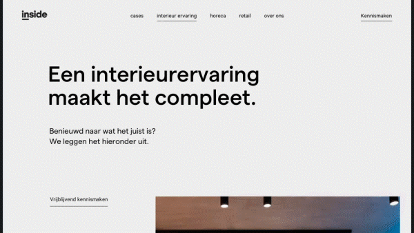
Grids.
2017 predicted a web design trend coined “brutalism” by some: a wild, challenging way of presenting content that makes users work a little bit to digest and understand everything. With 2020 having been brutal enough for most folks, we’re seeing a 180° pivot towards grids, offering legibility and simplicity.
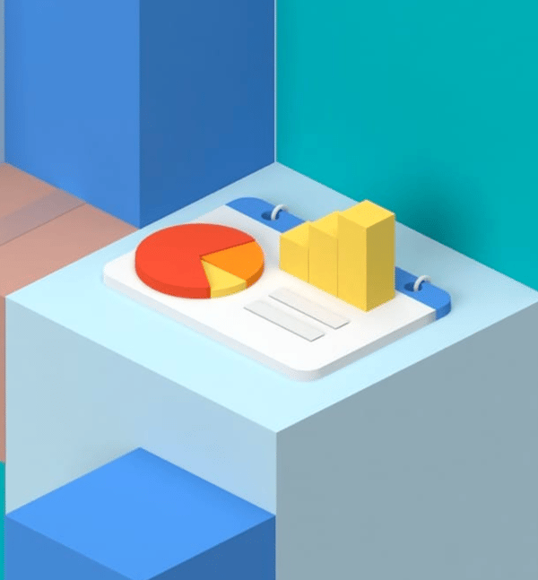
3D Elements.
This isn’t a new trend, but it is a growing one. We started a few years ago by seeing digital illustrations move from flat shapes and bold lines (like Mailchimp!) and designs towards gradients and shadowed depth. In 2021, we’ll begin to see 3D visuals everywhere, be it more conceptual illustrations of ideas or virtual mockups of actual products, the use of 3D can only increase. Our friends at Orange Sprocket are particularly accomplished at this, creating the image above and more!
Illustration.
We already talked about 3D illustration, but beyond that, the trend of illustrated headers and other visuals will be a continued trend through 2021. We see a movement towards surrealism. Like the conceptual illustrations we just mentioned, sometimes it is easier to illustrate “getting out of your head” by literally drawing a stylized ladder escaping a cranium, then to nail the exact facial expression using a model and a camera.
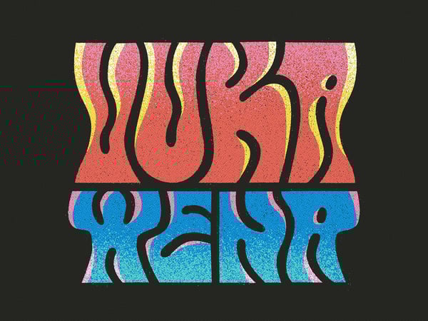
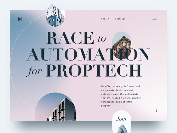
Bold typography.
2019 predicted more “adventurous type” and 2021 has seen the continuation of that, leaning towards bold retro type and large, impactful placement. Along with the venture into bolder, more experimental type, classic rules are being thrown out the window, allowing letters to be warped or transformed, not to increase legibility but to communicate something outside of what’s written. In part, a reflection of the chaos of 2020.
Scrolling interactions.
We’re seeing a lot of increase in scrolling interactions. By this, we mean things that happen while you scroll. Sometimes it’s as simple as a progress bar showing where you are on a page, and in other scenarios, it’s entire animations telling a visual story.
Immersive experiences.
It’s not that design is going back to the sudden, annoying background music of the Myspace page days, but rather we’re seeing an increase in complete visual, text, video and audio experiences becoming more common as our devices and internet speeds improve to handle the load. These ambient pages and designs must not be disruptive or set to autoplay, and allowing the user to turn them on intentionally with clear indication is best practice.
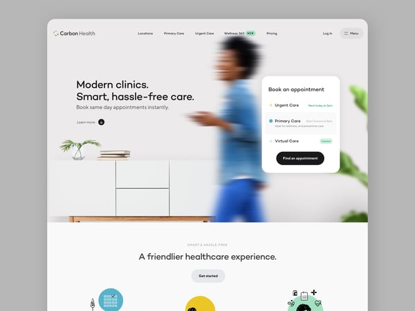
Muted colours + gradients.
Colours have moved from bold and impactful to muted and, in some cases, colourless. There’s been enough chaos in the world around us that our minds desire digital tranquility more and more, and designers have been happy to oblige.
Organic feels.
We weren’t allowed at work. Sometimes, we weren’t allowed at grocery stores. We were barely allowed into others’ houses. So, we resorted to nature. We got back outside. Journalists began to write about a newfound love of walking, of a return to the Scandinavian concept of ‘friluftsliv’: a connection to the outdoors through the concept of open-air living. Thus, our design tastes have taken a turn for the organic. Paint companies are selling more green hues, interiors have seen a trend of wood grain countertops and muted wall tones. Gone are the accent walls and high contrast colour schemes of previous years. We search for the tranquility 2020 lacked in our surroundings, redesigning them when necessary.
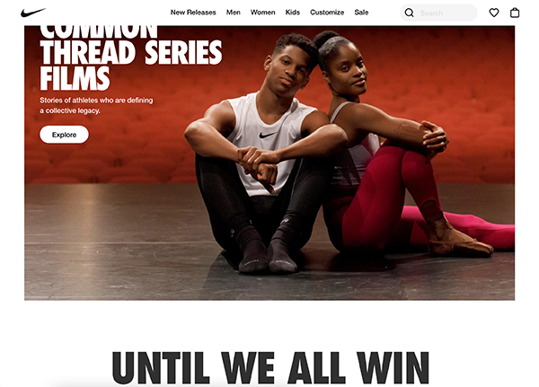
Socially conscious design.
2020 wasn’t just a year of the pandemic. It was a year of real issues coming to light, of people who have long been discriminated against speaking out. This was shouted just as loudly in design as in protests. We’ve seen companies like Nike, who have long had values involving diversity and inclusion as part of their brand, speak out and we’ve seen other companies jump on the bandwagon. If you’re considering vocalizing socially conscious ideas in your marketing, just make sure your brand values visibly align.
Trends will come and go.
It is important to remember that, beyond the excitement of shifting trends and new effects, a good logo is one that sticks in your customers' brains. Quite often, this means striving for timeless design rather than catering towards the newest fad. A professional graphic design agency will always prioritize ensuring that your logo does not need to be redesigned year after year, so that your customers can be continually delighted in recognizing your brand throughout its lifespan.